
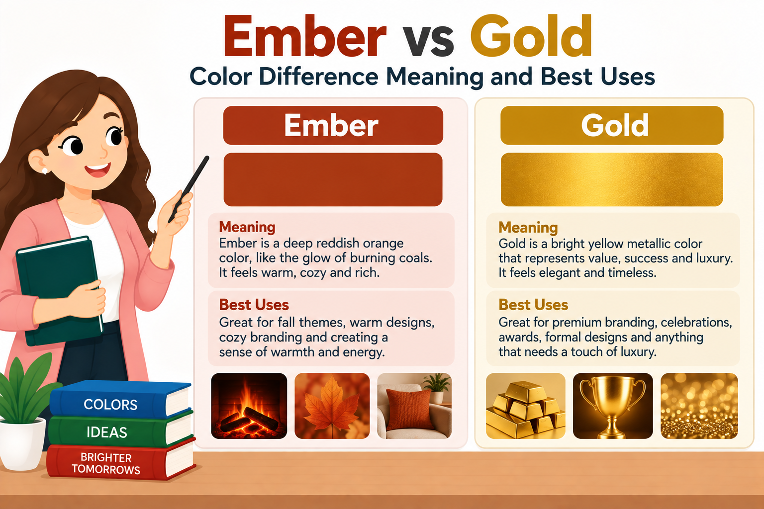
Ember vs gold both create warmth but they tell very different visual stories. Ember is usually a deeper fiery shade that leans toward orange red or burnt brown while gold is a brighter yellow based color associated with sunlight metal richness and luxury. If you are deciding between them the better choice depends on the mood and visual effect you want.
The confusion comes from their shared warmth. Both colors can appear in autumn palettes fire inspired designs clothing jewelry interiors branding and digital graphics. A muted ember can even look golden under warm lighting while a deep gold can take on orange or brown undertones. That overlap makes the boundary feel less like a straight line and more like a gradual transition.
Understanding the difference becomes much easier when you look at hue brightness saturation undertone and context together. This guide explains what each color means how they compare where each works best how they behave beside other colors and how to choose the right shade for your project. You’ll also find practical examples for design fashion interiors branding photography and everyday color choices.
Quick Definition
Ember is a warm fire inspired color that usually sits around orange red rust or burnt brown. Gold is a warm yellow to yellow orange color associated with sunlight and metallic richness. Ember tends to feel deeper and more dramatic while gold usually feels brighter more luminous and more luxurious.
Quick Answer
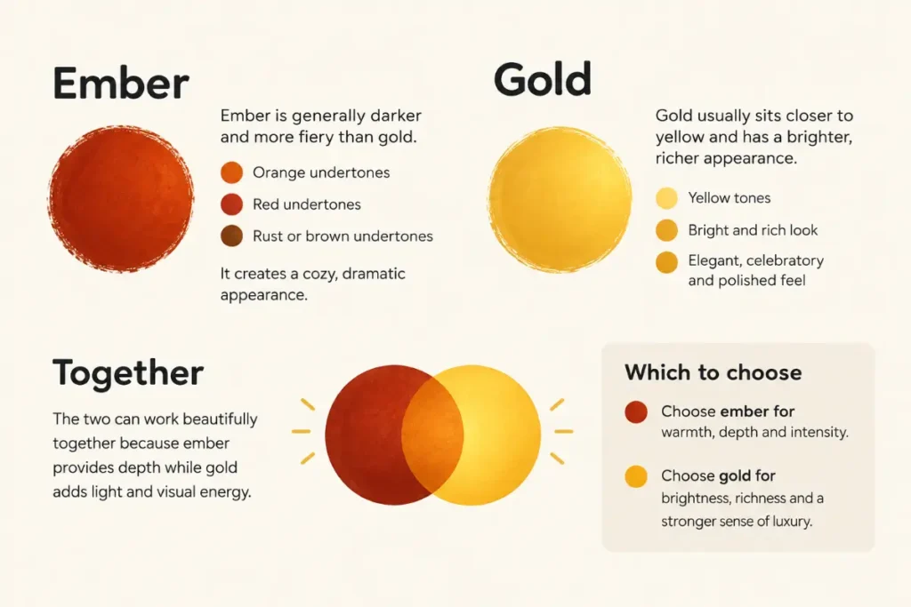
Ember is generally darker and more fiery than gold. It often carries orange red rust or brown undertones and creates a cozy dramatic appearance. Gold usually sits closer to yellow and has a brighter richer appearance. It can feel elegant celebratory and polished. The two can work beautifully together because ember provides depth while gold adds light and visual energy. Neither color is universally better. Choose ember for warmth depth and intensity. Choose gold for brightness richness and a stronger sense of luxury.
Comparison Table
| Feature | Ember | Gold |
|---|---|---|
| Basic appearance | Deep warm fire inspired shade | Bright warm yellow inspired shade |
| Typical hue family | Orange red rust and burnt brown | Yellow yellow orange and amber |
| Brightness | Usually medium to dark | Usually medium to bright |
| Warmth | Strong and earthy | Strong and luminous |
| Visual mood | Cozy dramatic fiery grounded | Elegant rich energetic celebratory |
| Common associations | Fire embers autumn leather clay warmth | Wealth sunlight jewelry celebration prestige |
| Best design role | Background accent or deep supporting shade | Accent highlight focal point or decorative detail |
| Common combinations | Cream charcoal brown olive gold | Black white cream brown navy ember |
| Clothing effect | Warm earthy and bold | Bright polished and refined |
| Interior effect | Cozy intimate and dramatic | Bright welcoming and sophisticated |
| Branding effect | Strong warm memorable and energetic | Premium confident established and refined |
| Digital use | Accent color for warmth and depth | Highlight color for emphasis and visual shine |
Meaning and Definition
What Ember Means
An ember is literally a small glowing or smoldering piece of wood or coal left after a fire has burned. That physical image strongly influences the color name.
As a color word ember usually suggests the appearance of glowing material near the end of a fire. Think of a fire pit after the flames have settled. You may see dark brown edges with areas of red orange or copper light. That mixture gives ember its distinctive character.
The important point is that ember does not represent one universal digital color value. Color names used in fashion design paint cosmetics interiors and digital palettes can vary. One brand may call a reddish orange shade ember while another may use the name for a deeper rust or brown orange.
Still the visual idea remains fairly consistent. Ember is warm subdued fiery and earthy.
It often has more visual depth than a straightforward orange. Instead of looking bright and playful it can feel smoky mature and grounded. That makes it useful when you want warmth without the intense brightness of pure orange.
What Gold Means
Gold is traditionally associated with the appearance of the precious metal. As a color it usually sits in the yellow family with warm orange or brown undertones depending on the specific shade.
Unlike a simple flat yellow gold often suggests richness and depth. Metallic gold also has a reflective quality that makes the color appear brighter in highlights and darker in shadows. That is why gold can look very different on a screen compared with actual metal fabric paint or printed material.
Gold can be pale and champagne like or deep and antique. It can lean toward yellow orange beige brown or even olive depending on the formulation.
The central idea remains brightness and warmth combined with a sense of richness.
Gold also carries strong cultural associations. People often connect it with jewelry awards celebration wealth achievement and prestige. Designers use these associations deliberately because color can communicate a message before a viewer reads a single word.
Key Differences Explained
Hue
Hue refers to the basic color family that your eyes perceive.
Ember usually lives around orange red and reddish brown territory. Gold generally sits closer to yellow and yellow orange territory.
This distinction matters because hue changes the emotional character of a color. Red and orange tend to feel energetic and heated. Yellow often feels brighter and more cheerful.
That gives ember a stronger fire quality while gold has a stronger sunlight quality.
Brightness
Brightness is another major difference.
Ember is usually darker or more muted. Its visual weight comes from its depth.
Gold tends to be brighter. Even darker antique gold often retains a sense of luminous warmth.
Imagine a fireplace at night. Ember resembles the glowing coal. Gold resembles the light catching the edge of something nearby.
That simple mental picture makes the difference easier to remember.
Saturation
Saturation describes how intense or vivid a color appears.
Ember can range from muted to strongly saturated. Many ember shades are softened by brown or red undertones which gives them an earthy appearance.
Gold can also vary widely. A vivid yellow gold looks much brighter than an antique gold with brown or gray undertones.
Because neither word defines one exact color value you should always examine the actual swatch before making a final decision.
Undertone
Ember usually has red orange or brown undertones.
Gold usually has yellow orange amber or brown undertones.
Undertone becomes especially important when choosing colors for clothing makeup paint interiors or branding. Two shades may appear similar in isolation but look very different next to white gray black cream or another warm color.
Emotional Effect
Ember tends to feel intimate warm powerful rustic and dramatic.
Gold tends to feel elegant bright prosperous celebratory and refined.
These emotional associations are not fixed rules. Context changes perception. A very dark ember can feel sophisticated while an antique gold can feel rustic and old fashioned.
Still these broad associations are useful starting points.
Texture
Ember often suggests texture even when no texture is physically present. The word brings to mind ash wood smoke glowing coal and rough natural surfaces.
Gold suggests smoothness shine polish and reflective surfaces.
That difference can influence material choices. Ember works naturally with leather wood clay stone and matte finishes. Gold often works well with polished metal glass satin velvet and glossy surfaces.
Which Color Should You Choose?
Choose ember when you want a color with depth.
It works particularly well for autumn inspired designs cozy interiors outdoor themes rustic branding and warm fashion palettes. It can also provide a strong accent against cream beige ivory or muted green.
Choose gold when you want light and richness.
It works well for luxury branding invitations celebrations jewelry inspired graphics premium packaging and decorative interiors. Gold can create a focal point without needing a highly saturated neon color.
If you’re stuck between them ask yourself one simple question.
Do you want the color to feel more like glowing fire or reflected light?
Glowing fire points toward ember. Reflected light points toward gold.
Sentence Examples
Because these words are color names as well as ordinary nouns ember and gold can appear naturally in many descriptions.
- The designer used an ember shade to give the room a warm autumn feel.
- Gold details made the invitation look more elegant.
- Her sweater was a rich ember color that worked beautifully with cream pants.
- The gold trim added a bright finishing touch to the dark furniture.
- The sunset shifted from ember orange to pale gold.
- The brand uses deep ember tones to create a warm and confident identity.
- A thin gold border made the dark background look more polished.
- The artist mixed an ember inspired orange with muted brown for the painting.
- Gold accessories can brighten an otherwise neutral outfit.
- The combination of ember and gold created a warm palette with plenty of contrast.
These examples also show why the two terms shouldn’t be treated as exact synonyms. They overlap in warmth but differ in visual direction.
Common Color Mistakes
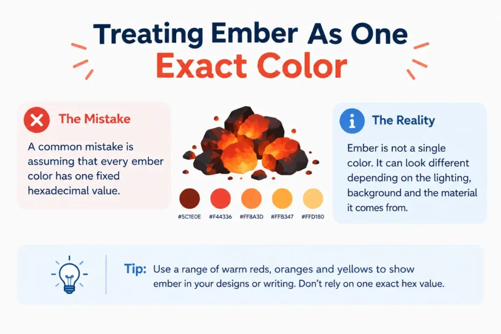
Treating Ember as One Exact Color
A common mistake is assuming that every ember color has one fixed hexadecimal value.
Color names are often descriptive rather than mathematically universal. Different manufacturers designers and digital systems may assign different values to the same descriptive name.
If accuracy matters use the actual color code or physical sample rather than relying on the name alone.
Treating Gold as Simple Yellow
Gold is not simply bright yellow.
A convincing gold usually depends on the balance between yellow orange brown brightness contrast and sometimes metallic reflection.
A flat yellow can look cheerful while gold can look richer and more dimensional.
Ignoring Lighting
Lighting can dramatically change warm colors.
An ember shade under warm indoor light may look more red or brown. Gold can appear almost orange under some lighting conditions and pale yellow under cooler light.
Always check physical colors in the lighting where they’ll actually be used.
Comparing Names Instead of Swatches
Color names are useful for communication but they aren’t enough for precise matching.
If a client says they want gold ask for a reference if the exact shade matters. The same applies to ember.
A name gives you a direction. A swatch gives you precision.
Using Too Many Warm Colors Together
Ember gold orange copper rust and red can create a beautiful palette but they can also blur together.
Use contrast in lightness and saturation to keep the design readable.
A dark ember background with a lighter gold accent often creates clearer hierarchy than several similar warm shades competing for attention.
Pronunciation Guide
The pronunciation of ember is straightforward.
It is commonly pronounced EM bur.
The first syllable receives the main stress.
The word has two syllables.
Gold is pronounced with one syllable.
It sounds like gohld in standard American English.
Neither pronunciation creates a major regional challenge for most English speakers. The more interesting issue is meaning. People can recognize both words easily but may use them differently depending on the visual context.
If you are describing a color aloud you can make the meaning clearer by adding a descriptive word.
You might say deep ember orange or warm metallic gold.
That gives the listener a much clearer picture than the color name alone.
Etymology and Word Origin
The word ember has a long connection with fire. Its history is tied to old Germanic language forms associated with glowing or burning material.
The modern English word refers first to a piece of glowing or smoldering fuel. Its use as a color name comes naturally from the appearance of such material.
Gold has an even deeper linguistic history because the word refers to both a metal and the characteristic color associated with it.
The English word developed from older Germanic forms and is related to words for gold in several Germanic languages.
The history of both terms helps explain their modern color meanings.
Ember gets its color identity from a visual experience involving heat fire and glowing material.
Gold gets its color identity from a valuable metal and its distinctive appearance.
That difference in origin also explains why the emotional associations are not identical even though both colors belong to the warm side of the visual spectrum.
Regional Usage
American English
American English uses both ember and gold naturally as color descriptions.
Gold is especially familiar because it describes a common material as well as a color. Ember is more descriptive and often appears in fashion design paint names branding cosmetics interiors and creative writing.
American usage does not assign one fixed shade to either name.
British English
British English uses both color terms in much the same way.
The meaning of gold is stable because the word has a long established connection with the metal. Ember can be more context dependent because its use as a color description is newer and more creative.
There is no major British spelling difference that changes the comparison.
Australian English
Australian English also uses both terms naturally.
Ember can work especially well in descriptions involving warm earth tones fire autumn landscapes and interior palettes. Gold remains a familiar color name with broad everyday use.
Again the exact visual shade depends on context.
Canadian English
Canadian English follows the same general pattern.
Both terms are understood as warm color descriptions. Gold has the more established everyday meaning while ember is often used as a descriptive or creative shade name.
There is no major regional distinction that would make one term correct and the other incorrect.
Grammar Rules and Word Function
Ember and gold can both function as nouns.
You can say:
The ember was still glowing.
The gold was polished.
Both can also function as modifiers when describing a color.
She wore an ember dress.
He chose a gold frame.
In these examples the color names act before nouns and tell us what kind of color or material is being described.
Gold has an extra grammatical feature because it can refer directly to the metal.
The museum displayed ancient gold.
That sentence is about the material rather than the color.
Ember can also refer directly to the physical remains of a fire.
The embers were still warm.
This distinction matters because context determines meaning.
When you say ember red you clearly indicate a color inspired by fire.
When you say gold ring the phrase can describe a ring made from gold rather than simply a ring that has a gold color.
This is one reason gold has a wider everyday meaning than ember.
How the Colors Work in Design
Interior Design
Ember works well in rooms designed to feel warm and intimate.
Think about a reading corner with dark wood cream walls and an ember colored chair. The shade adds warmth without making the room feel overwhelmingly bright.
Gold can play a different role.
A gold lamp frame mirror edge or decorative accent can catch light and create a polished appearance. Gold usually works best as an accent rather than covering every surface.
The combination can be especially effective. Ember provides the visual foundation while gold supplies small points of brightness.
Fashion
Ember is a strong choice for fall clothing.
It pairs naturally with cream brown beige olive charcoal and warm denim. Because it is usually deeper than orange it can feel easier to wear in larger pieces such as jackets sweaters dresses and trousers.
Gold works beautifully as an accessory.
Think jewelry belts shoes bags buttons or small decorative details. Metallic gold can add brightness without requiring a completely bright outfit.
For a bold look an ember dress with gold accessories creates a classic warm contrast.
Branding
Ember can communicate energy warmth courage creativity and craftsmanship.
It can suit brands connected with food hospitality outdoor products craft goods beauty or experiences built around warmth.
Gold communicates a different message.
It can suggest quality achievement prestige tradition and premium positioning.
Still gold needs careful handling. Too much can make a design feel heavy or overly decorative. A restrained gold accent often communicates more confidence than a page covered in gold.
Digital Design
On screens the distinction becomes especially useful.
Ember can create a warm accent that stands out against neutral backgrounds. It can also work as a button or highlight when the surrounding palette is cool and muted.
Gold is often better suited to highlights and premium visual details.
For digital accessibility you should not choose a color based only on appearance. Text needs enough contrast against its background so users can read it comfortably.
That means the exact shade matters more than the color name.
Choosing the Right Shade
A color name gives you a starting point but the actual shade determines the result.
If you want a strong ember effect look for a shade with enough depth and visible orange red or brown character. A shade that is too pale may start looking like peach or tan.
For gold look at the balance between yellow and orange.
A bright yellow gold feels energetic. A deeper antique gold feels mature and traditional. A pale champagne gold feels softer and more modern.
You can also adjust the surrounding colors.
An ember shade beside cream can feel warm and elegant. The same ember beside black can feel dramatic.
Gold beside white can feel clean and bright. Gold beside deep navy or charcoal can feel luxurious.
Color never works alone. Its neighbors influence how your eye interprets it.
Ember and Gold Together
These colors can complement each other extremely well.
The reason is simple. They share warmth but differ in brightness and depth.
Ember can act as the grounding color. Gold can act as the light catching accent.
Imagine a dark ember wall with gold picture frames. The wall creates depth while the frames provide small points of brightness.
The same principle works in clothing. An ember coat with gold jewelry can look rich without being overly colorful.
In branding a dark warm base with restrained gold details can create a premium visual identity.
The key is balance.
If both colors are equally strong the design can become visually crowded. Give one color the leading role and let the other support it.
Related and Confused Terms
Amber
Amber sits between yellow orange and brown. It can resemble both ember and gold depending on its brightness.
Amber usually feels lighter and more translucent in visual descriptions.
Copper
Copper is a reddish orange brown associated with the metal. It often sits close to ember but has a stronger metallic association.
Bronze
Bronze is generally darker and browner than gold. It can provide a more muted and antique appearance.
Rust
Rust is usually an earthy orange red brown. It overlaps strongly with deeper ember shades.
Burnt Orange
Burnt orange is a darker muted orange. It can look similar to ember but usually stays more clearly within the orange family.
Amber Gold
Amber gold combines yellow gold qualities with orange warmth. It can sit between traditional gold and fire inspired colors.
Mustard
Mustard is a muted yellow with brown or olive undertones. It is generally less fiery than ember and less luminous than bright gold.
Copper Gold
Copper gold blends reddish warmth with golden yellow. It can bridge the visual gap between the two main color families.
These terms show why color comparison can’t always be reduced to a strict line. Warm colors often overlap and shift depending on saturation brightness lighting and neighboring colors.
Expert Editor Insight
An experienced color editor would avoid treating either name as a precise universal specification. Color names are useful for communicating mood and visual direction but they don’t guarantee an exact hue. Professional designers usually work from a swatch color code paint sample or approved material when accuracy matters. The best practical tip is to use the name to describe the idea and the actual color value to control the result. If a client asks for gold or ember ask for a visual reference before making a final match.
Conclusion
Ember vs gold comes down to two different kinds of warmth. Ember usually feels deeper and more fiery with orange red rust or brown character while gold generally feels brighter and more luminous with yellow and orange influence. Neither is automatically better because each creates a different visual mood.
Ember works especially well when you want depth warmth drama and an earthy character. Gold works better when you want brightness elegance richness or a polished accent. Their differences become even clearer when you compare them beside neutral colors or use them in real materials.
The simplest memory trick is to think of a glowing coal for ember and reflected sunlight for gold. Once you picture those two scenes the distinction becomes much easier to recognize and apply.
FAQs
Is ember a shade of orange or red?
Ember usually sits around the orange red and reddish brown part of the warm color spectrum. There is no single universal ember shade so the exact appearance can vary. Some versions look strongly orange while others look more like rust or burnt brown. The name comes from glowing embers which naturally contain several warm tones rather than one perfectly fixed color.
Is gold brighter than ember?
Gold is usually brighter than ember. Gold commonly has a luminous yellow or yellow orange appearance while ember tends to be deeper and more muted. That said the exact result depends on the chosen shade. A pale gold can be very bright while a dark antique gold can be relatively subdued. Likewise a vivid ember can be much brighter than a dark ember tone.
Which color feels warmer?
Both are warm colors but they express warmth differently. Ember usually feels hotter and more fiery because it connects visually with glowing coal fire and burnt orange. Gold feels warmer through brightness and light. If you want a cozy earthy kind of warmth choose ember. If you want a radiant cheerful kind of warmth gold may work better.
Does gold go with ember?
Yes. Gold and ember can create a strong warm palette because they share similar temperature while offering useful contrast. Ember can provide depth and a grounded base while gold can add brightness and decorative emphasis. This pairing works particularly well in fashion interiors invitations packaging and branding. Keep one color dominant so the combination doesn’t become visually overwhelming.
Is ember a good color for clothing?
Ember can be an excellent clothing color because it has the warmth of orange without always being as bright. It works particularly well in fall and winter wardrobes. Ember pairs nicely with cream beige brown olive charcoal and dark denim. A deep version can feel sophisticated while a brighter version can create a stronger statement.
Is gold a warm or cool color?
Gold is generally considered a warm color because it is based around yellow with frequent orange or brown influence. The exact temperature can shift depending on the shade. A bright yellow gold looks strongly warm while a pale muted gold may feel more neutral. Gold can also appear cooler when surrounded by very warm colors because color perception depends partly on contrast.
Can ember and gold be used in branding?
Yes. The combination can create a memorable warm identity. Ember can suggest energy craftsmanship warmth and confidence while gold can suggest quality prestige and achievement. The strongest results usually come from using one as the main color and the other as an accent. The exact shades should also be tested for readability and contrast across different screens and printed materials.
Are ember and gold the same color?
No. They can overlap but they are not the same color category. Ember generally points toward deeper orange red rust or brown while gold points toward yellow yellow orange and metallic warmth. Their shared warmth can make them look related but their brightness undertones and emotional associations are different. Think of ember as fire depth and gold as warm reflected light.
